Solstice Cannabis
.jpg.jpeg)
A brand of firsts.
Solstice is one of the first retail cannabis companies established in Washington State, but prior to recreational legalization, the Solstice brand had already become very well-known in the medical cannabis community.
I expanded on the brand to design Solstice's first pre-roll package design – also a first to be seen at the medical cannabis retailers. At these dispensaries, the minimalist, white aesthetic of the package design proved extremely popular and refreshing. It created a sense of legitimacy and professionalism that had not yet been realized in the new and bustling world of retail cannabis.
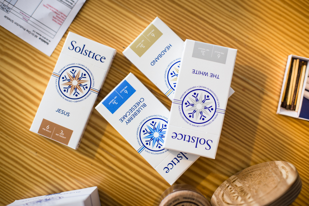
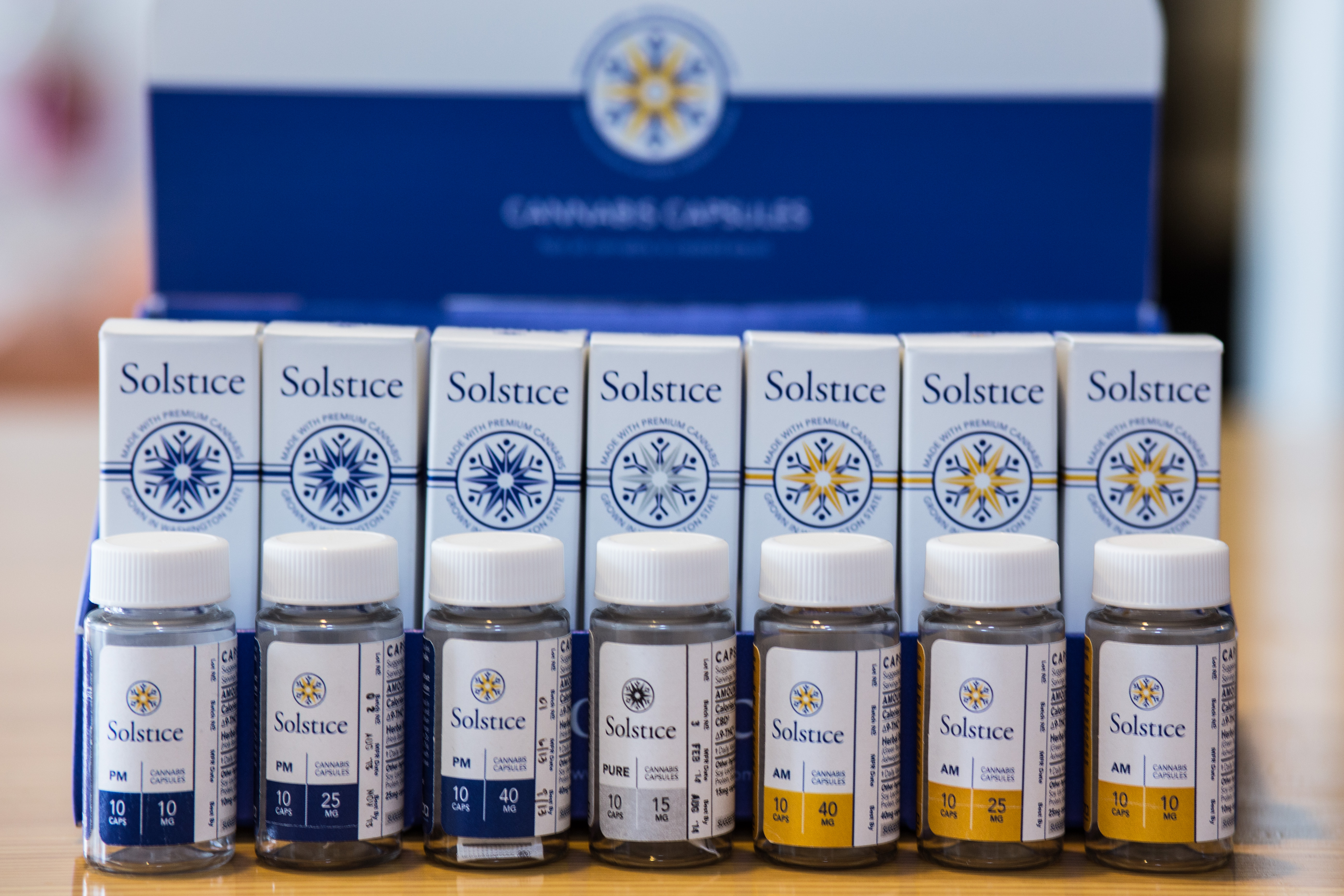
The pre-rolls design featured a unique color to represent each cannabis variety, while the medical capsules used the primary brand colors to designate "AM," "PM," or "Pure."
After a successful launch of the original package designs, I continued to work with Solstice, stewarding the brand over the next seven years, providing creative direction, design and photography for new products, marketing collateral and communications across a variety of media – including print and packaging collateral, web and social media.
The new world of recreational cannabis
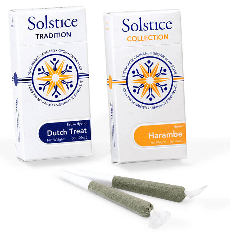
When cannabis became legal for recreational use in Washington State, Solstice's brand needed to shift to accommodate new business strategies and the realities of the new market. Solstice continued to grow their award-winning cannabis varieties in-house under the new "Tradition" label. They also began producing cannabis grown from local partner farms under the new "Collection" label. I created a new design system to help visually differentiate between the two product families and strengthen the overall brand identity.
New market, new products
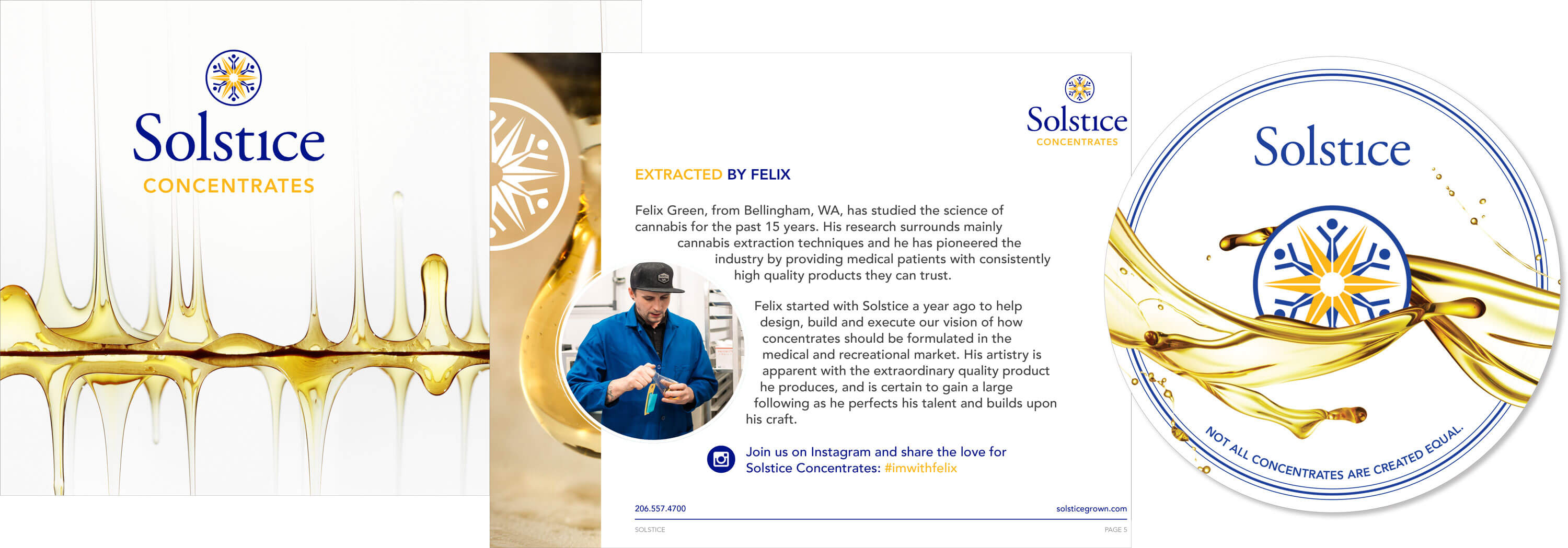
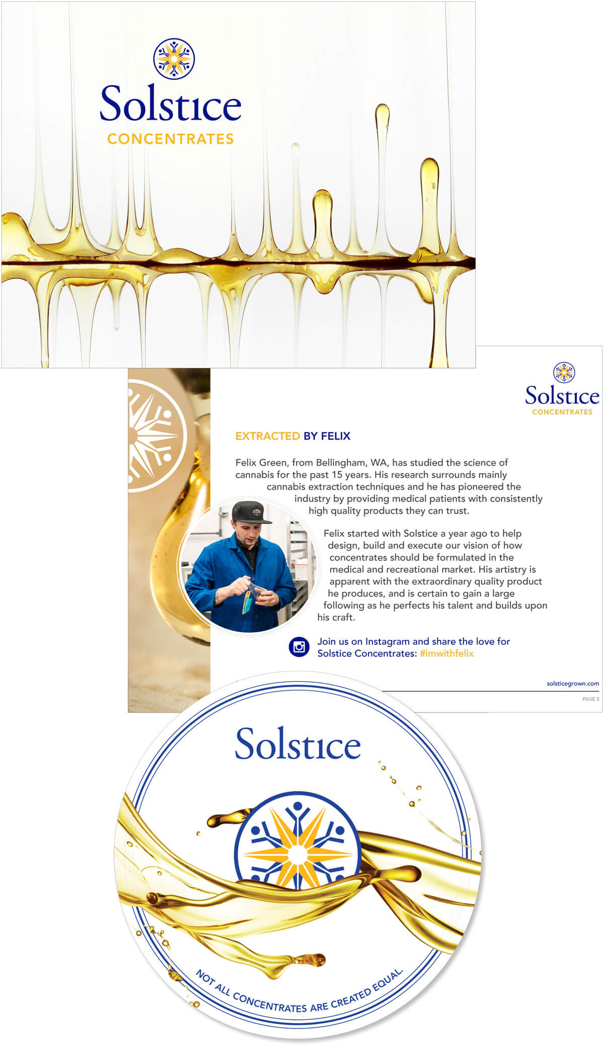
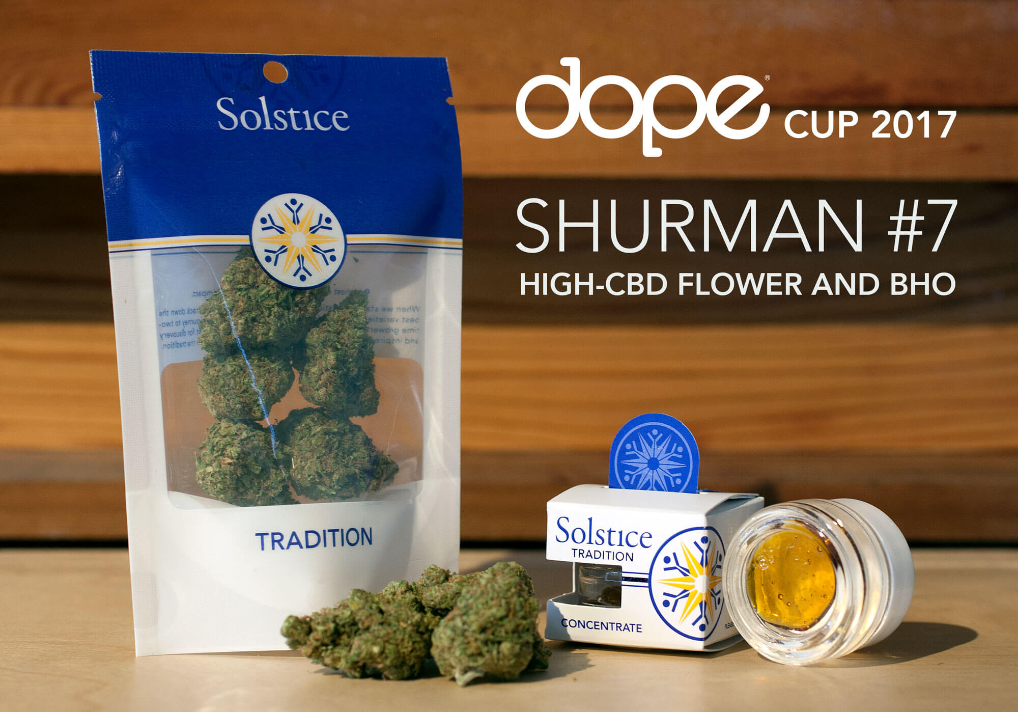
As the recreational market got underway, cannabis concentrates also became more popular. Solstice invested in a high-end lab to produce some of the highest quality oils and concentrate products on the market. I designed a new package to elevate Solstice Concentrate on the retail shelf, and enable customers to view the quality of the product through windows in the side and bottom of the custom box.
To help promote Solstice's line of cannabis concentrates to retailers, I designed a PDF booklet showcasing the product line, processes and quality control to excite retailers and empower them to sell the new product to their customers. Retailers were also provided a Solstice-branded round silicone "dab pad" as a promotional item with every order they made.
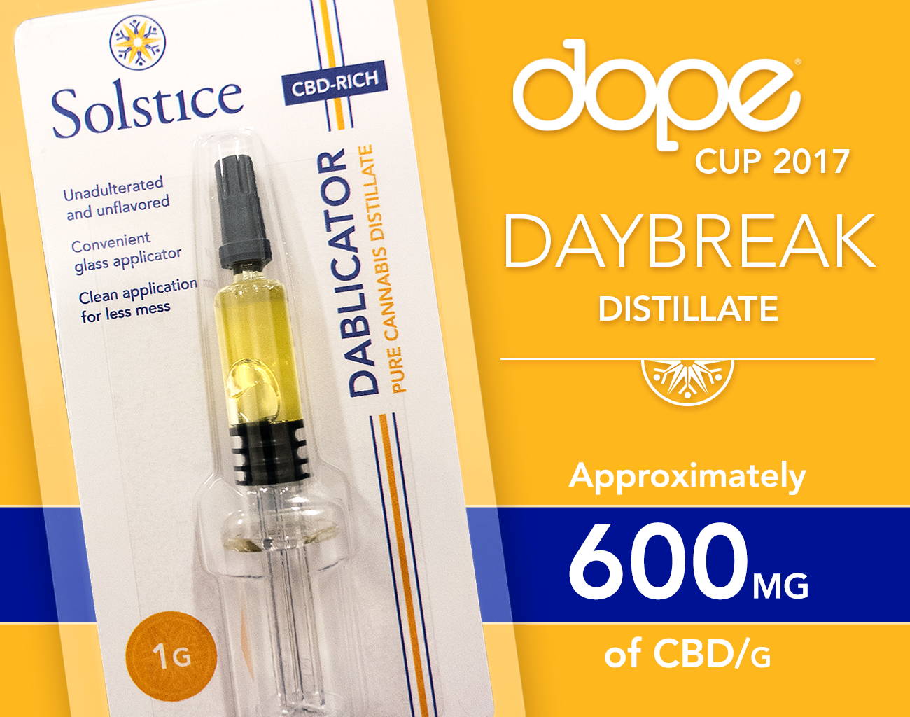
The Dablicator
Solstice was one of the first to market with a concentrate distillate syringe, which made dispensing the product easier and cleaner. We called it the "Dablicator," and I designed a hanging clamshell-style package to ensure high-visibility of the product behind the retail shelf.
Award-winning
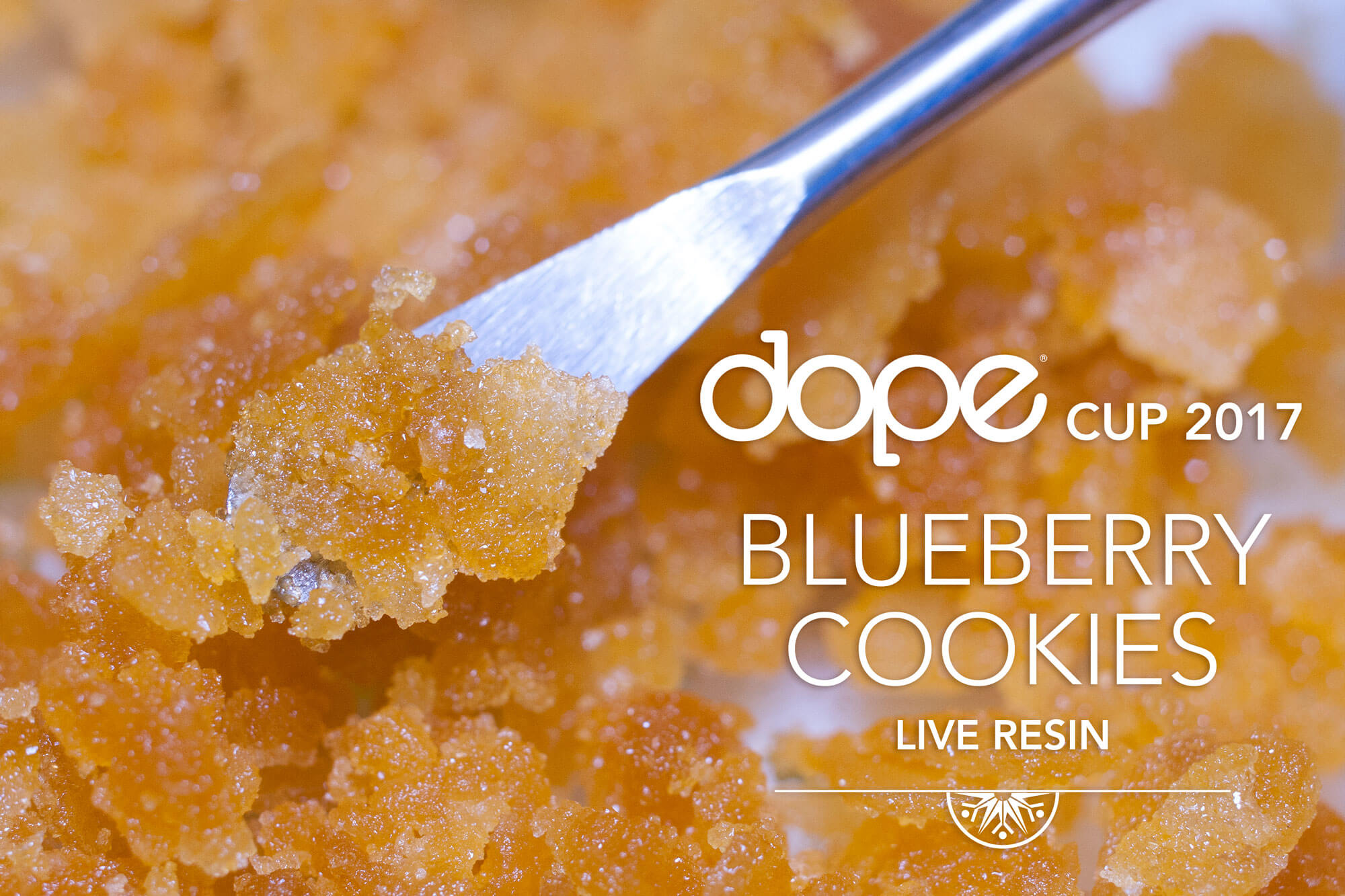
I am proud to say that during my tenure stewarding the brand, Solstice won the award for Best Overall Brand at the Dope Cup a number of years in a row. Of course, they also won many awards for their cannabis flower and concentrate products – every award was an opportunity to create new marketing material and share the news over social media. I was fortunate to also contribute my photography skills for this work as well.
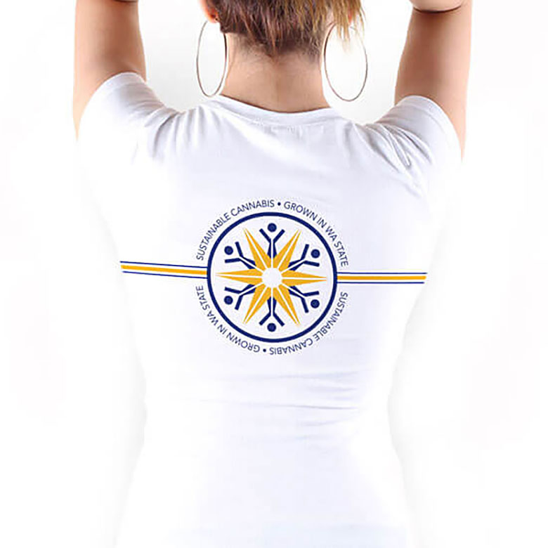
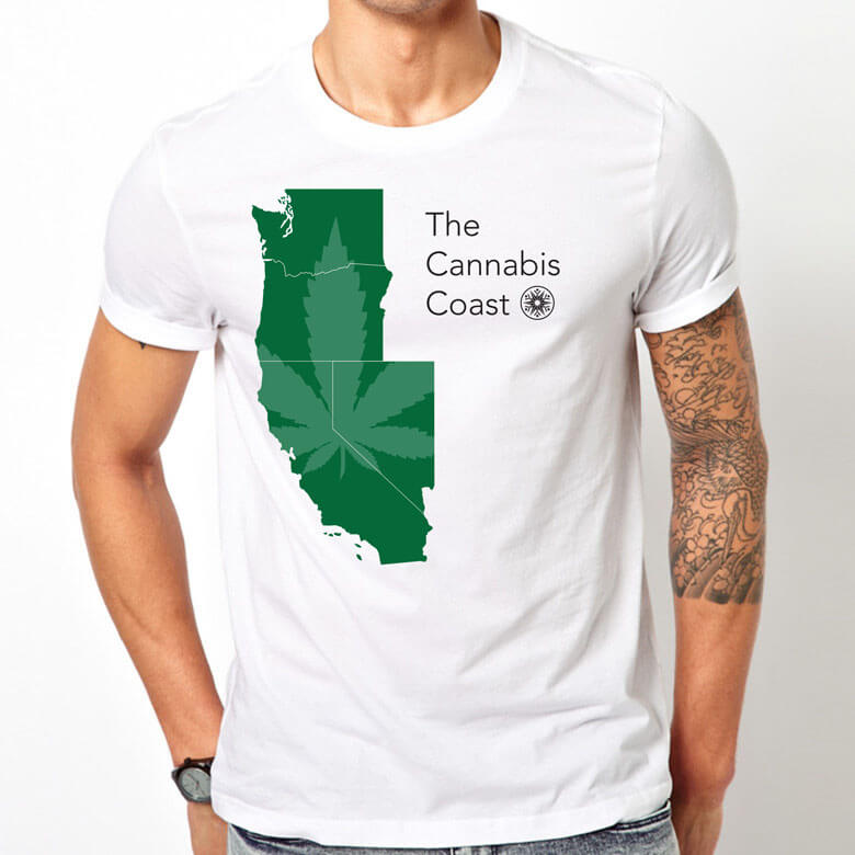
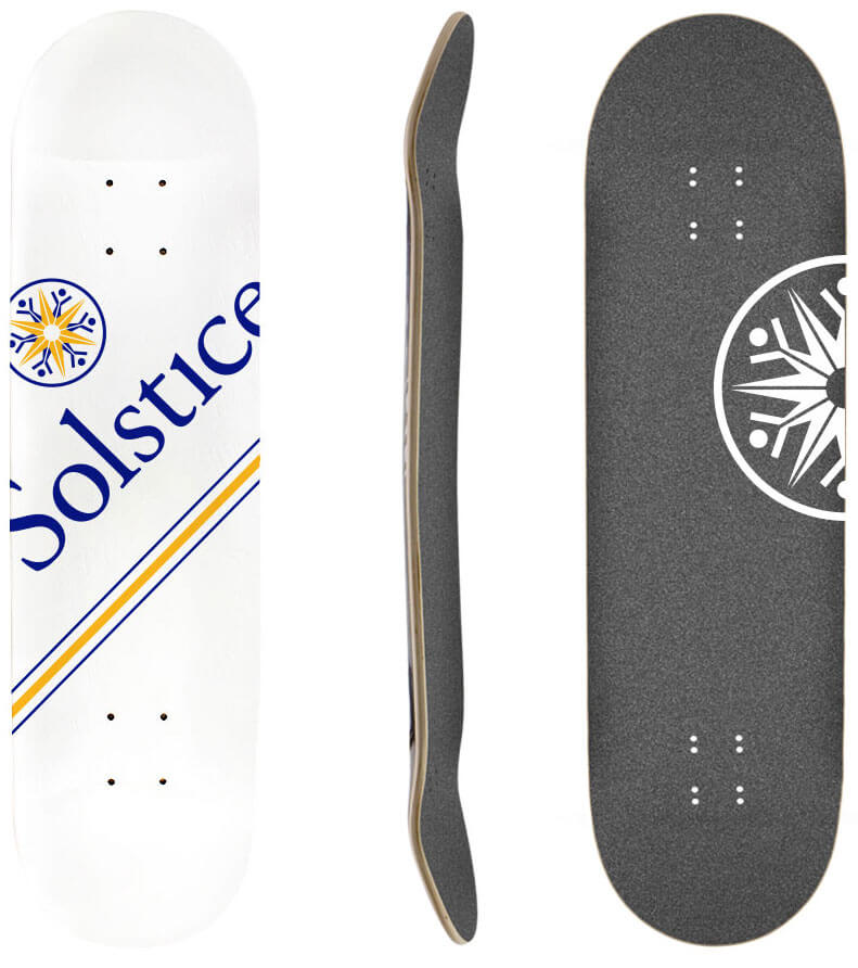
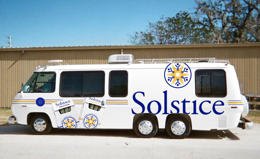
Creating Culture
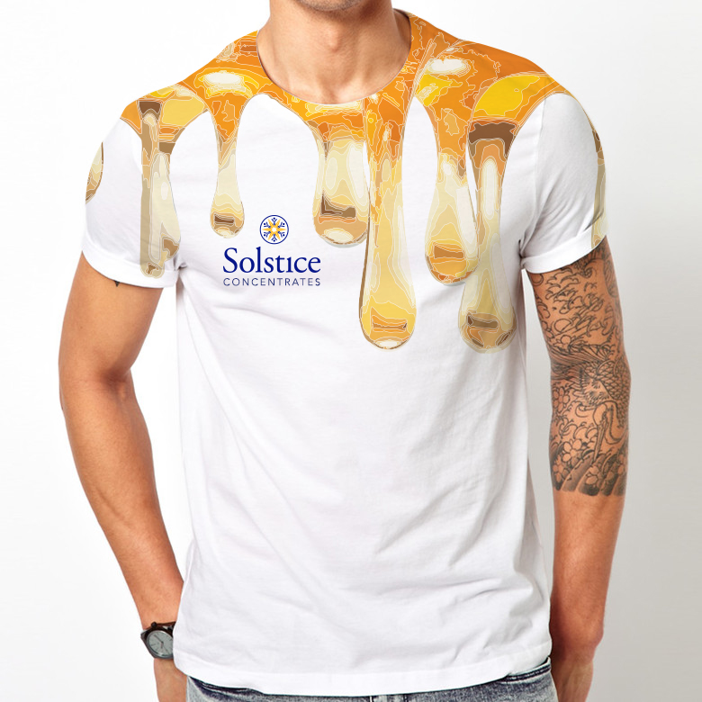
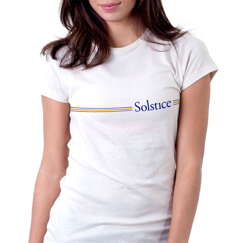
A cannabis brand is a lifestyle brand. Working with the Marketing Director, I created a number of concepts and initiatives to elevate the Solstice brand in everyday culture, including swag such as t-shirts and skateboard decks, and a mobile showroom made from a converted vintage RV.
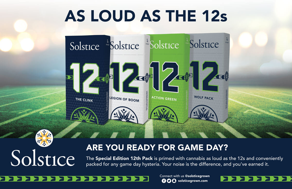
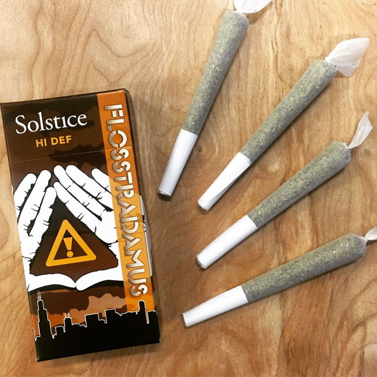
Building culture also involvs connecting with the local community. I designed a number of special release packs, such as the "12 Pack" – a nod to the local Seattle sports fans – and the "Flosstradamus" pack, which was cross-promoted with the music duo for their performance in Seattle.
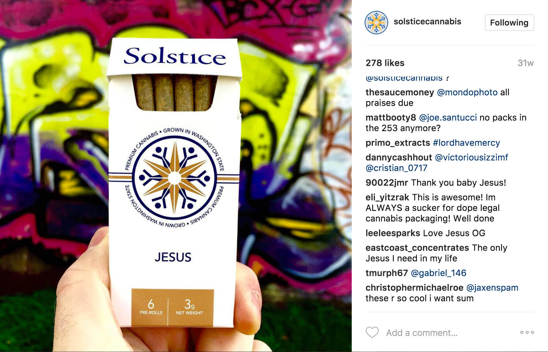
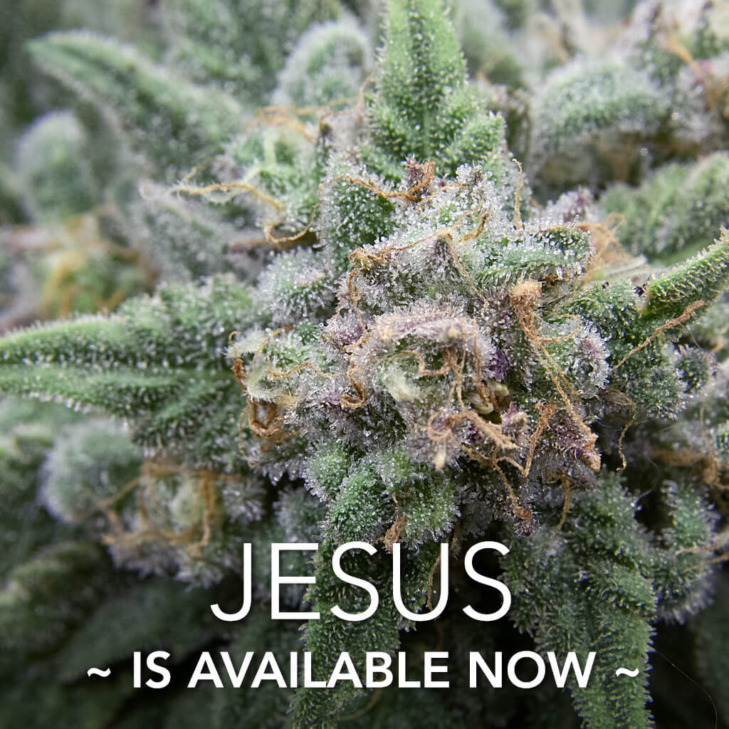
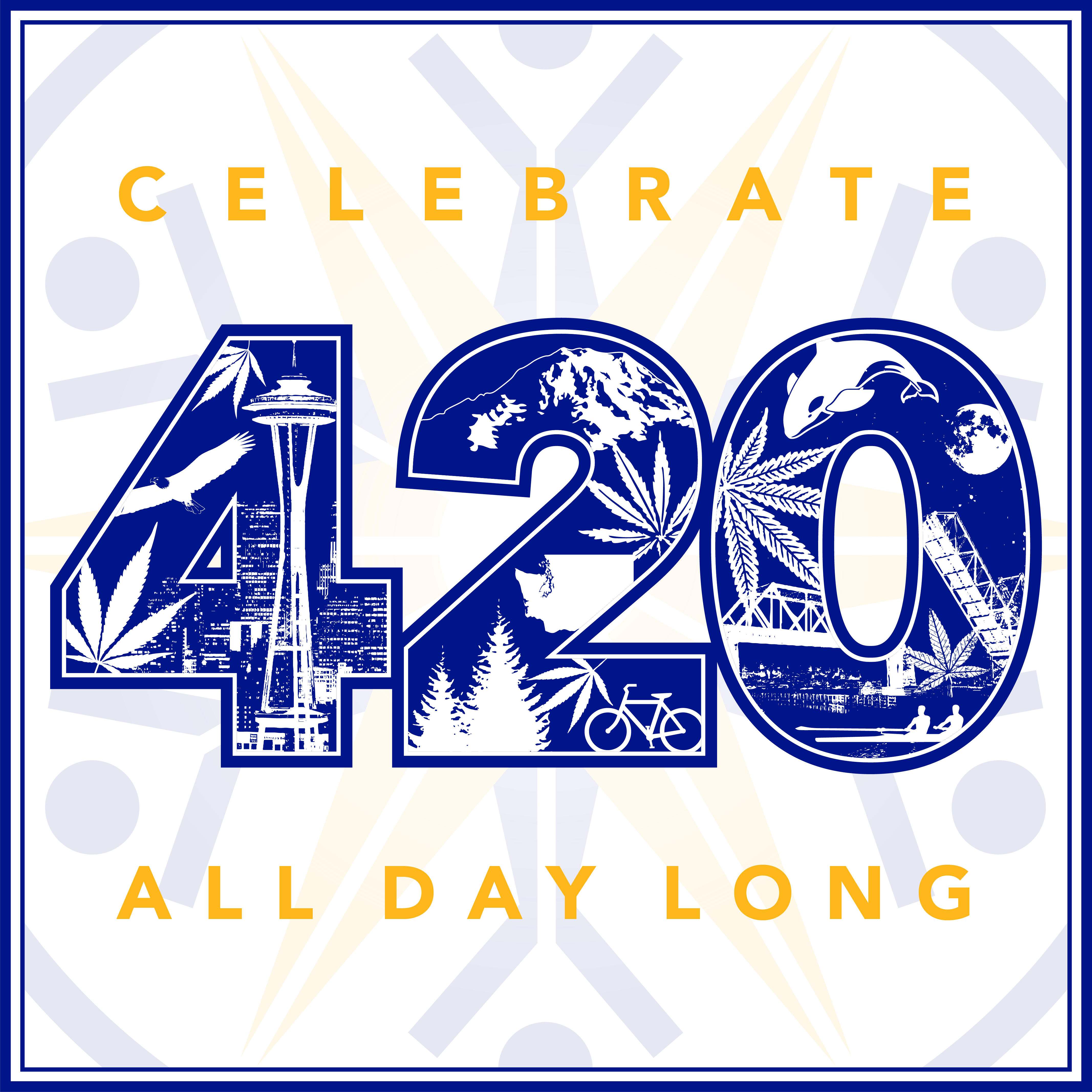
Of course, online marketing is crucial not just for product awareness but also in building a culture around the brand. I designed a number of social media campaigns timed around product releases, such as the hotly anticipated release of the annual spring "Jesus" crop, and cannabis culture "holidays," such as 4/20.


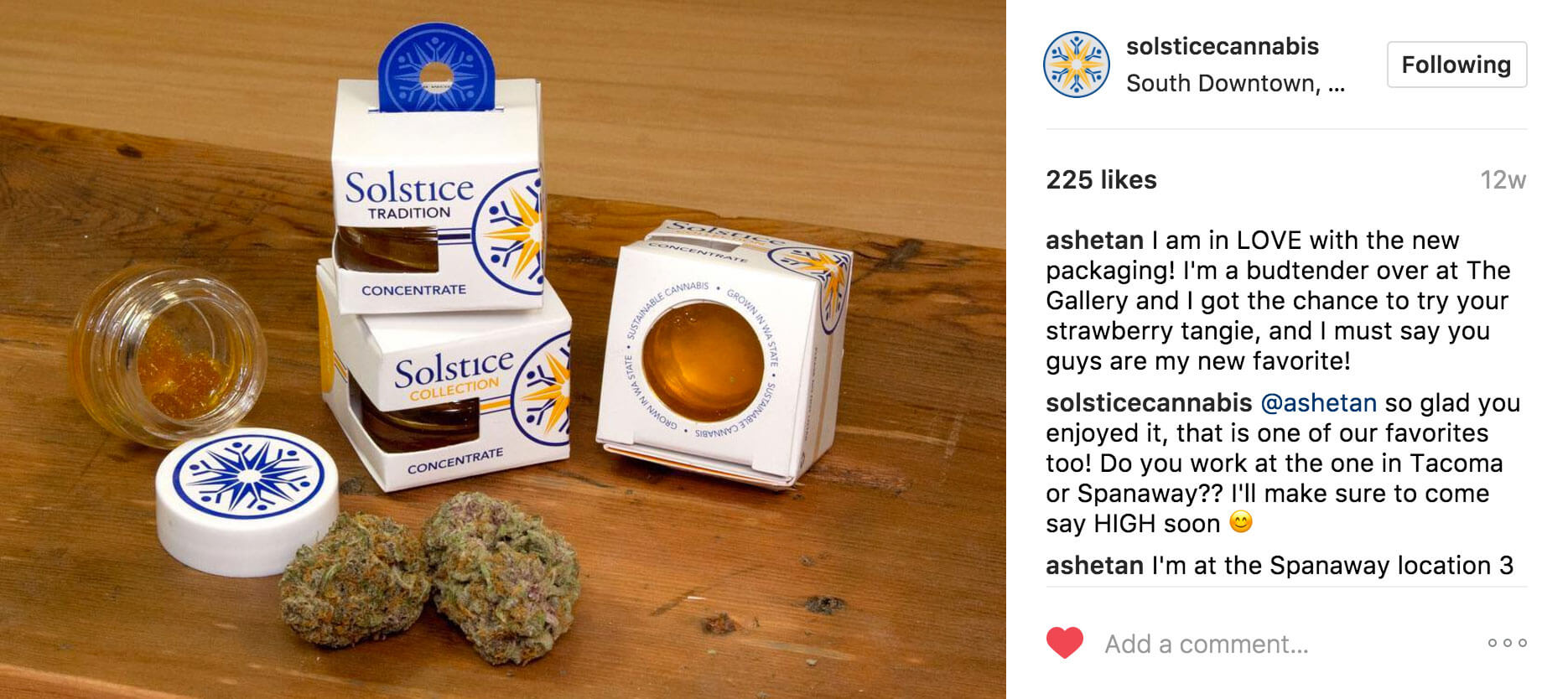
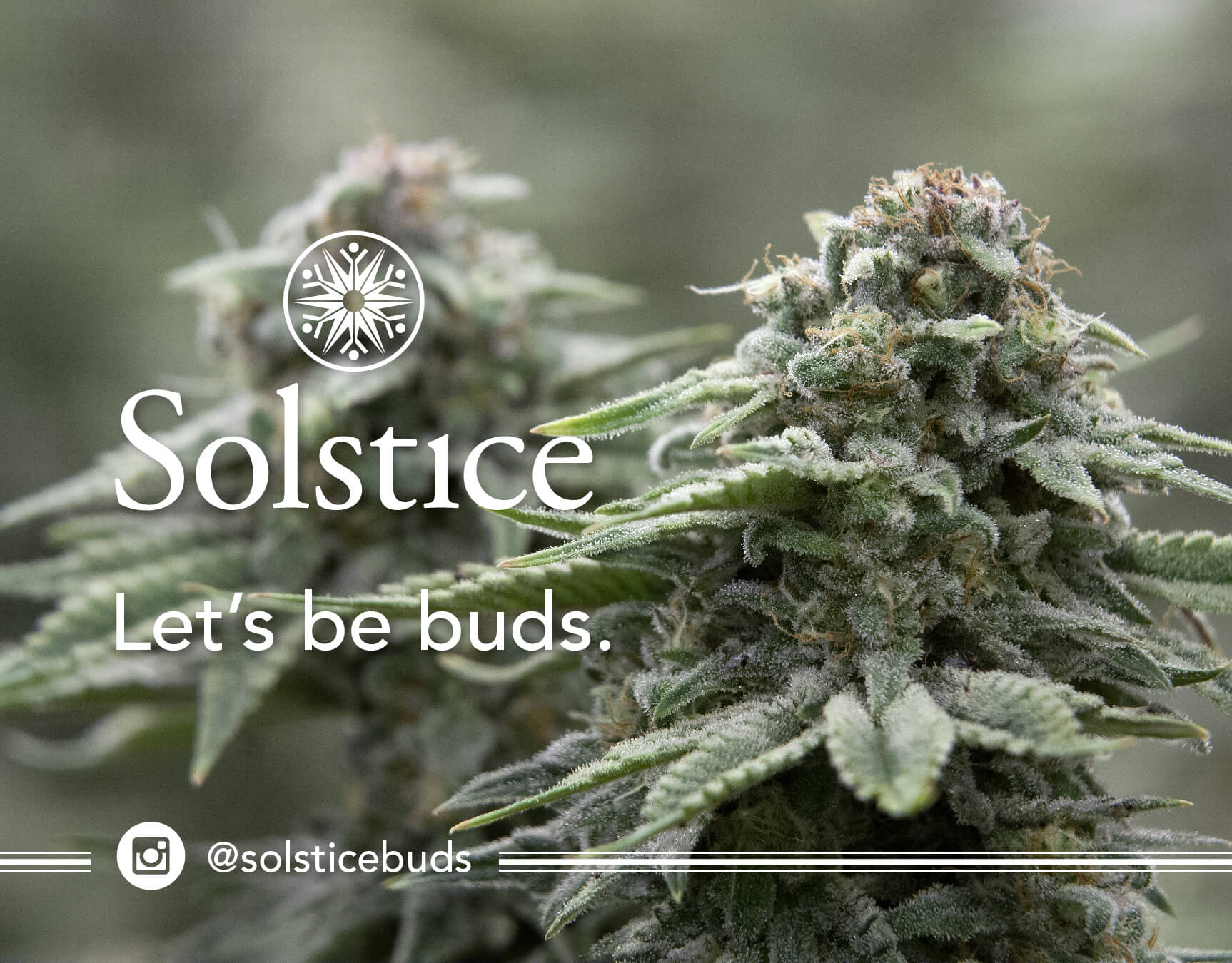
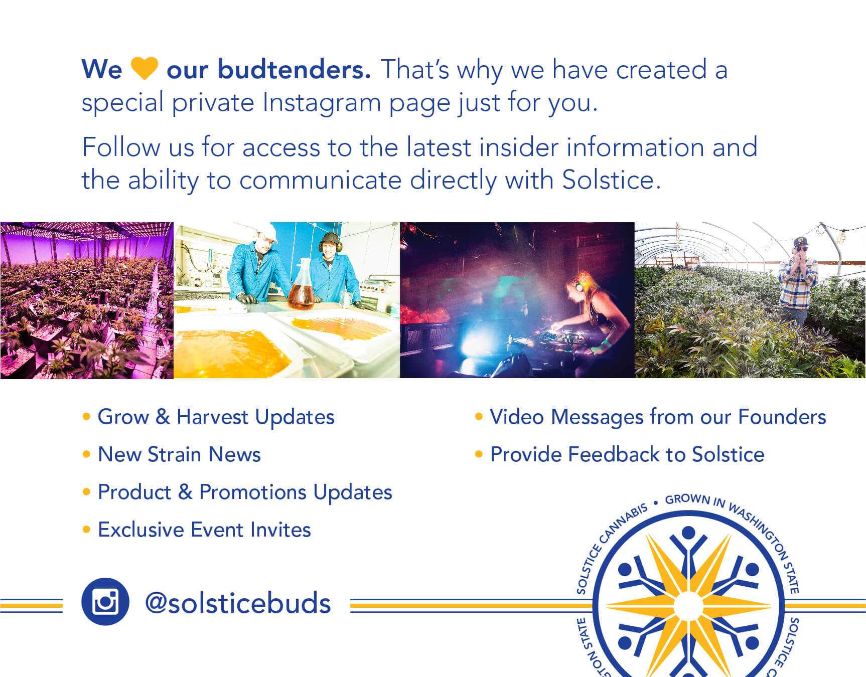
Let's be buds.
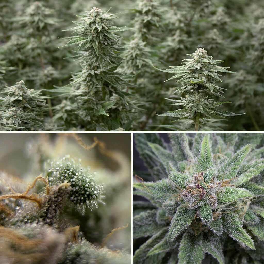
For a brand like Solstice, the budtenders at the retail store are the most influential advocates, so a lot of effort goes into nurturing those relationships. To show appreciation and provide exclusive access to information and benefits, Solstice created an exclusive Instagram page to connect directly with budtenders. I designed a card to promote the initiative, which was included with every order. (The flower photography is also mine.)
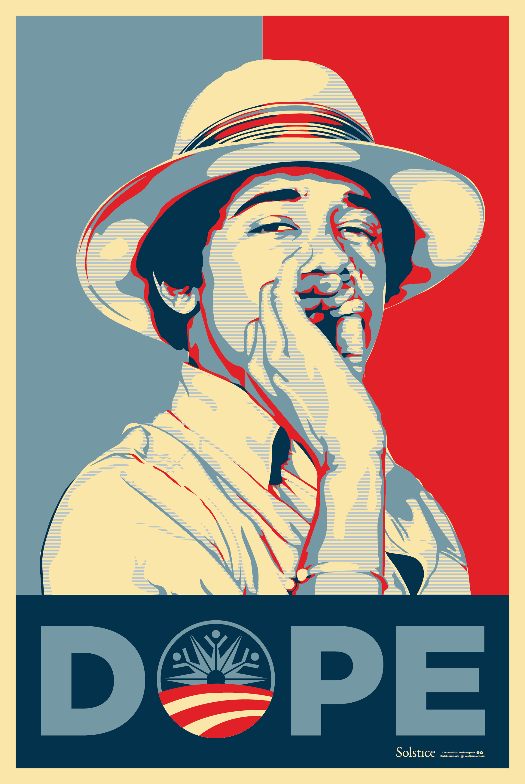
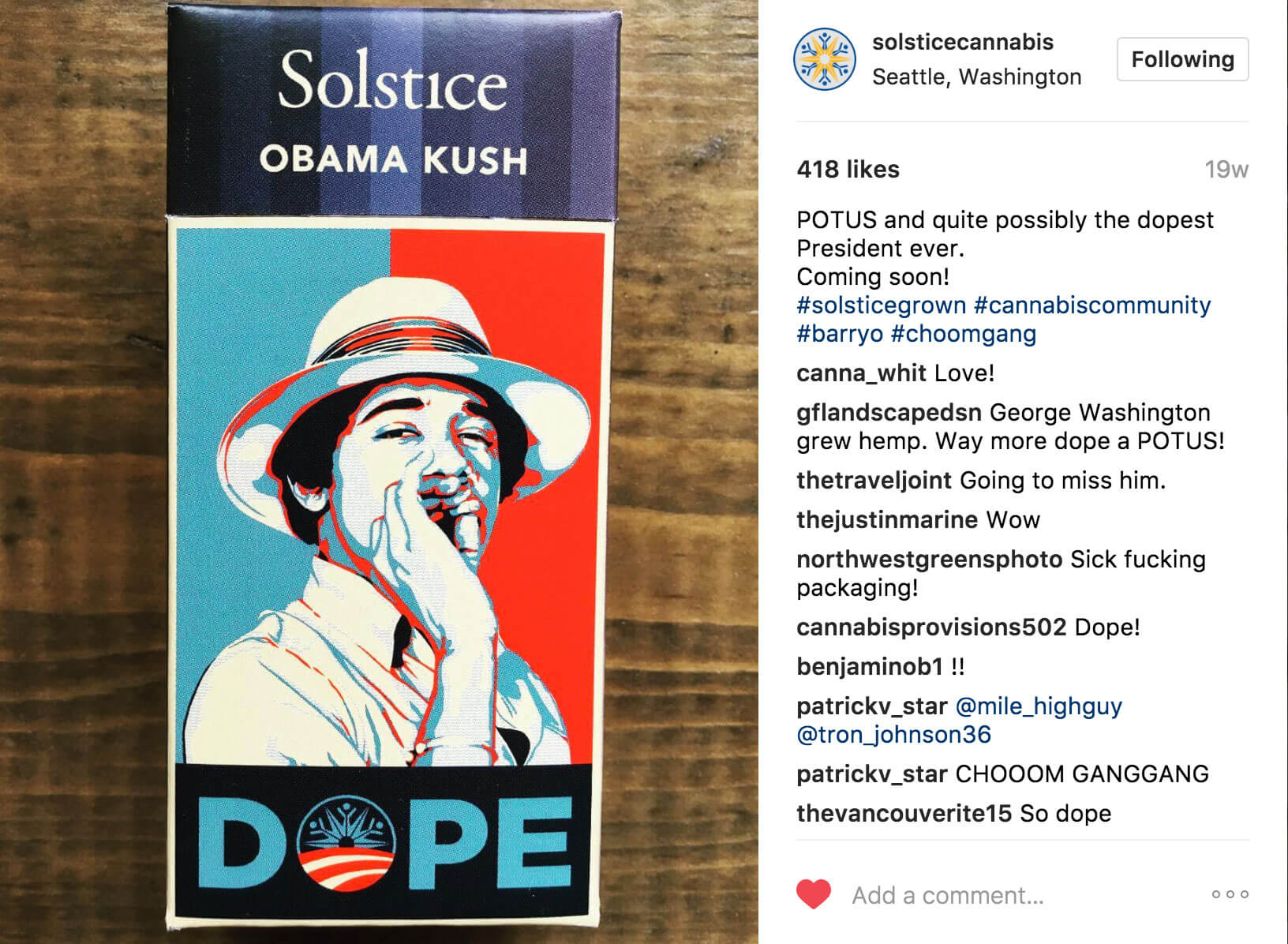
Obama Kush
Obama Kush was a favorite cannabis variety, especially during the years of Obama's Presidency. It was only fitting to create a special release pack for the final months of his last term. The artwork was created as a parody in the style established by Shepard Fairey's "Hope" poster. A limited set of large high-quality posters were also printed, framed and gifted to Solstice's most valued relationships. The artwork and the pre-roll packs were well received and widely shared on Social Media.
Opportunity & Growth
Working with Solstice was an exciting and dynamic experience. To be so intimately involved in promoting a great company, especially in a new and volatile industry, presented unique challenges and great opportunities, and I'm really proud of the work we did together.
Photography selections from the Jesus release campaign.